
WEBSITE DESIGN FOR ARTISTS
Creating an effective artist website is more than just showcasing your work; it's about strategic design, content organization, and knowing your audience. Here's a breakdown of making an effective artist website whether your goal is getting more shows, selling more art, or just getting organized as an artist.
Purpose and Layout: Before you begin, think about what is the purpose of your artist website? Most contemporary artist websites fall into four categories: Archives, Portfolios (for curators), Portfolios (for sales), and Online Shops. My website www.jaclahav.com goes for the portfolio site and prioritizes getting more shows. What will you choose?
1. Functionality Is Key:

The Two Click Theory: most people only click twice on your website. On my site its often the landing page and then the bio/cv. 80% of people leave my website after viewing the CV. So its best to give them all the relevant information early on! The first page should address “who you are, and what you do”.
I really love a scrollable landing page. This minimizes the need for excessive clicking and you can put all the pertinent info at the top. My format is Image, News, Install Image, About Text, Artwork, Social Proof, Etc
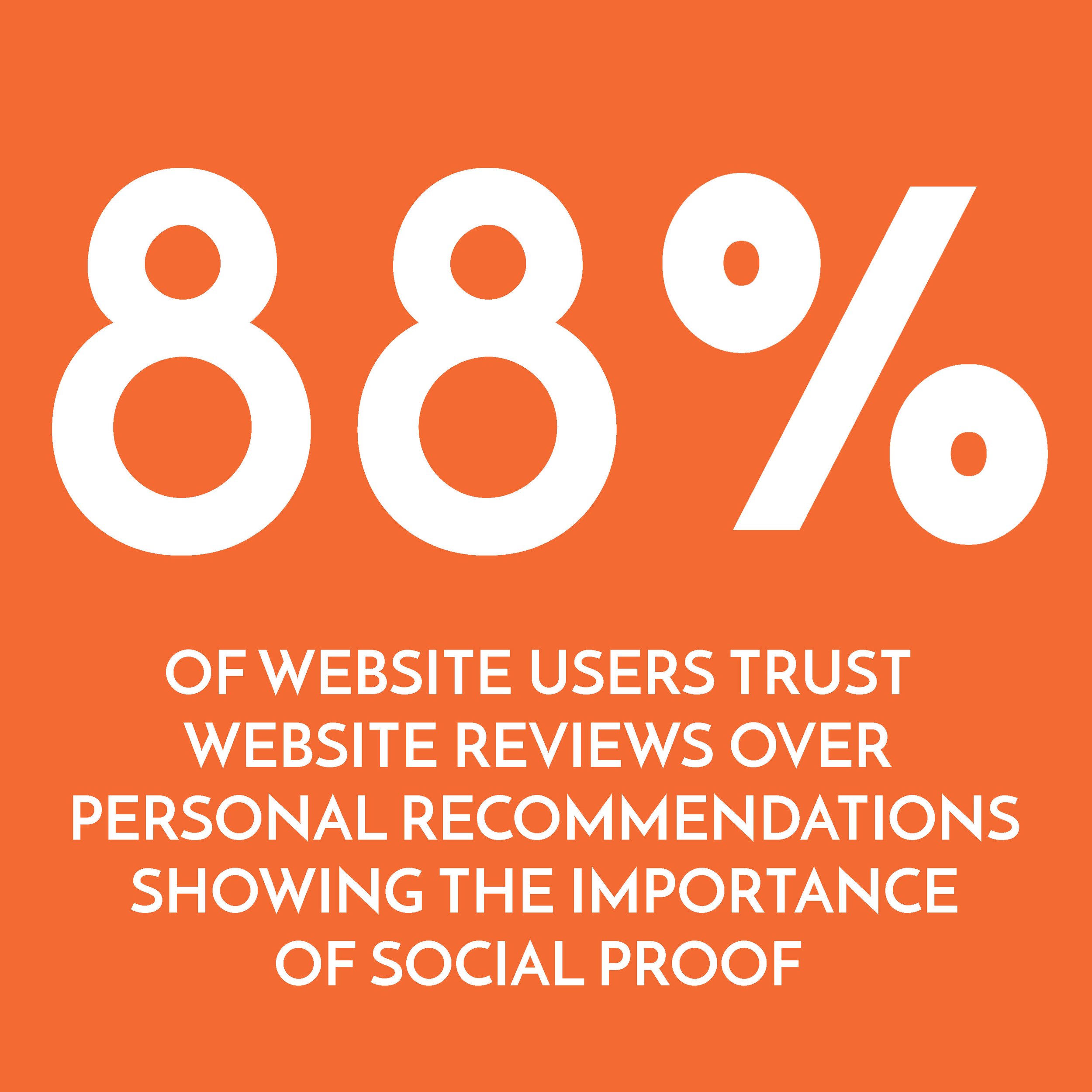
Social Proof is evidence that other people like your work. People are sheep and have no imagination. They need to see your work “in situ” (ie on the studio wall or in exhibition images) and want to know that others approve of it (Key signs of approval: you’ve had exhibitions, people have bought your work, people have written about your work). If you dont have this, its okay. Post what you do have and build from there.
Exhibition Images: So many artists don’t put these on their website. Exhibitions are crucial if your audience is curators/gallerists. Surprisingly, they many curators (like myself) don’t have imagination and love seeing how you would display your work in an exhibition. NOTE: Give exhibitions their own dedicated section.
Presentation of Art: After an exhibitions menu tab, I put the Artworks menu tab. When displaying a body of work under the “Artwork” tab I like the format of - Large image of work on a wall, then Description, then individual images of individual artworks.
Design Simplicity: Keep designs simple and modern, avoiding elements that distract from the artwork (like drop shadows or funny fonts)
2. Content Strategy:
News: I like having a news section, but you must commit to updating your news. If you cant, do not have a news section. Linking to social media like Instagram can be a great way to allow audiences to find your current content.
Personal Connection: Highly recommend including a personal portrait and details in the 'About' section. This helps in creating a connection with the audience. There is a trend to putting an “artist portrait” (ie a picture of you with your work) on the first landing page too.
3. Navigation and User Experience:
Simplicity in Navigation: Limit the menu options as much as possible. If you nest menus, dont have more than 3-4 options. Most viewers only click twice and will get lost very easily.
Ideal menu bar format: Exhibitions, Artwork (with nested current and archive), Other Projects, About (with nested CV/BIO and Contact)
One trick to reduce clutter is to name your home page with a period “.”
Another organization tip is to combine the artist statement and CV into one page and consider creating an archive section for older works. The less buttons there are to click the better.
**Mobile Compatibility: Designing with mobile users in mind is crucial as many access websites through mobile devices. Squarespace does this automatically. Always check your site and links on your computer AND mobile.
4. SEO and Online Visibility:
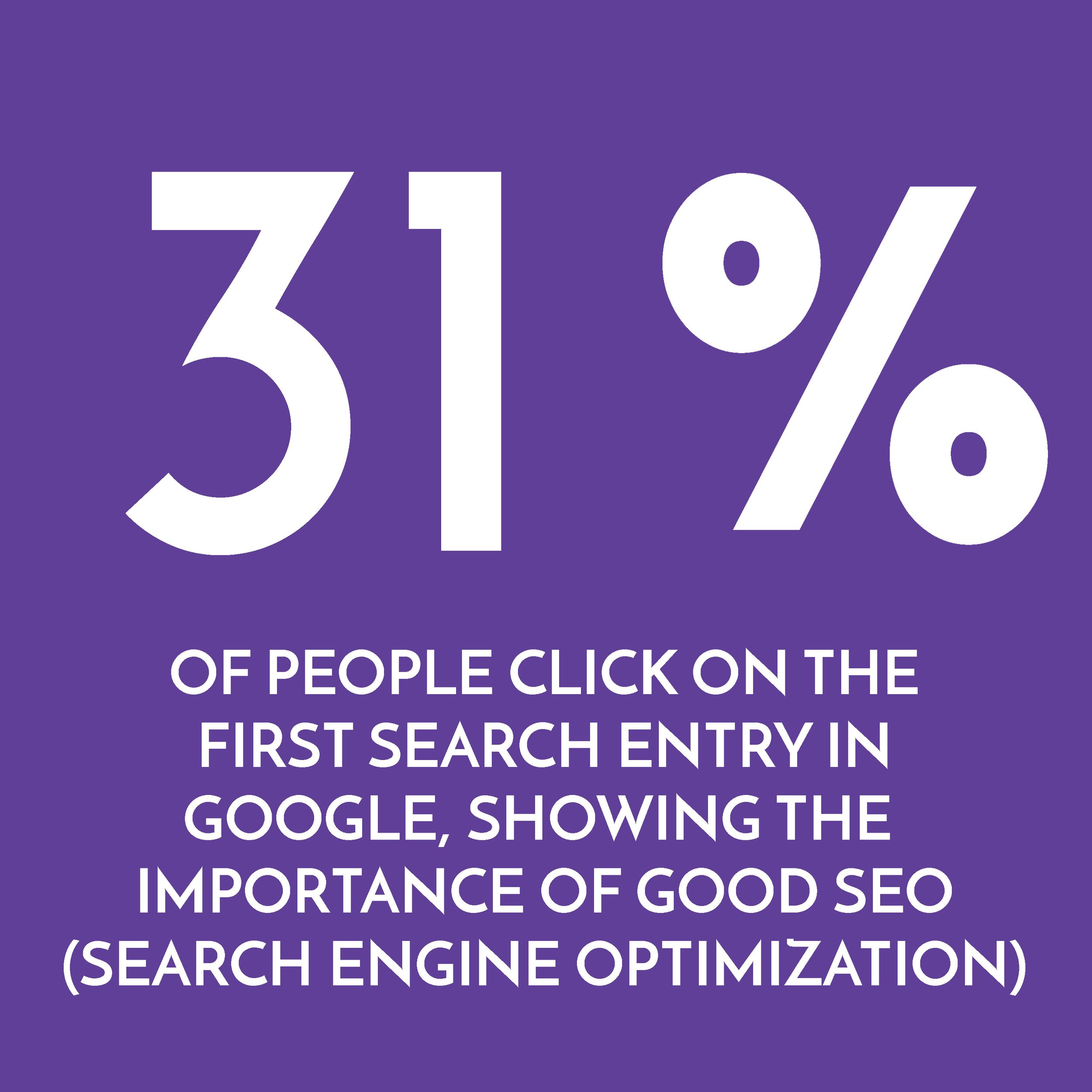
Increasing Visibility: The purpose of your website is to increase visibility. Its good for pointing people at a portfolio, but also if someone searches your name on google its nice to know they are getting the information you want them to see. SEO stands for Search Engine Optimization. Its a way to tell google what is important in their searches. Ive found the easiest way to do this is to label your images with the terms you want to come up. So if I want an image of me to come up in a google search, I would label that image “portrait_photo_artist_jac_lahav_contemporary_painting“. Those are key words and they let google know that this photo should be listed when people search for those terms.
When you google something, usually images and video come up first in the search, then web pages. Thats why its important to have your images properly labeled so that the images you want come up when searching your name. Video often gets top billing on google searches, so if you are trying to knock out some bad data, posting lots of videos with the appropriate tags can often help.
A wikipedia page also gets top billing when google searching an artist name. To gett a wikipedia page, you will need to have enough press to be considered “notable”. If you do, its possible to go to a website like UpWork and hire someone to write a wikipedia entry for you.
5. Technical Aspects and Legal Considerations:
Legal Disclaimers: Im not sure if we really need legal disclaimers, but I dont see how its a bad idea. Here is what I use and feel free to plug in your name for mine. NOTE: I am not a legal expert, use at your own risk.
TERMS AND CONDITIONS
PRIVACY
Platform Choices: I use squarespace, its easy to set up yourself, has all the analytics and shop you might need but is pricey and most importantly looks great on both mobile and desktop. Here is a run down of the top three options:
SQUARESPACE:
Pros: User-friendly interface, modern design templates, all-in-one hosting and e-commerce solutions, and strong customer support.
Cons: Limited customization without coding, and higher pricing compared to other platforms.
WORDPRESS
Pros: Highly customizable with numerous themes and plugins, scalable for various website sizes, strong community support, and excellent for SEO.
Cons: Steeper learning curve for beginners, requires regular maintenance, and potential security vulnerabilities if not updated.
WIX
Pros: Easy-to-use drag-and-drop interface, a wide variety of templates, built-in features for social tools and SEO, and a free plan option.
Cons: Limited scalability, inability to change templates without rebuilding the site, and less robust e-commerce features compared to specialized platforms.
NOTE: After you are done with your website, schedule time to look at it periodically, checking your website every six months to once a year.
In conclusion, an artist's website should be more than a digital portfolio. It's a dynamic platform that requires thoughtful design, strategic content organization, and a keen understanding of audience engagement. By implementing these expert insights, artists can enhance their online presence, engage their audience more effectively, and navigate the digital art world with greater success.